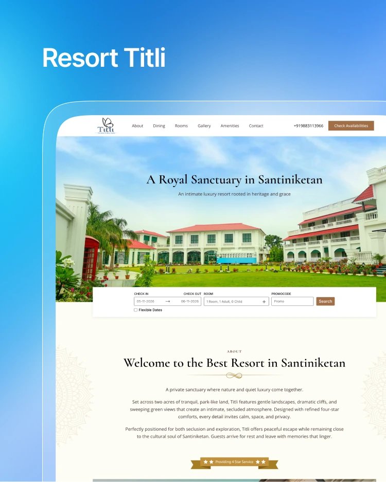
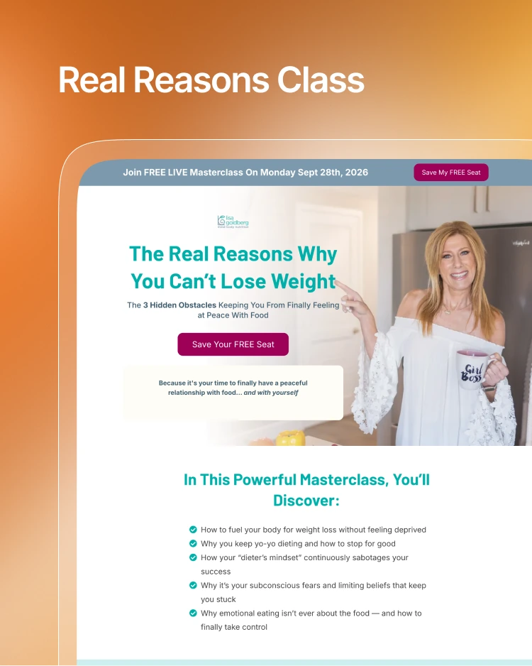
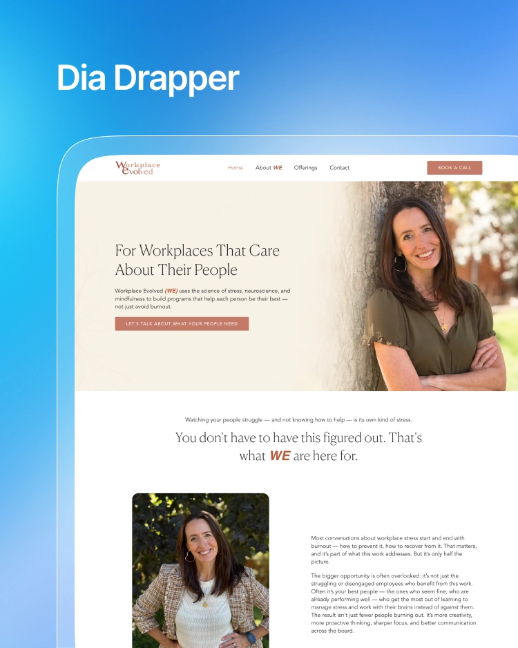
The Challenge
Patricia Daly is a classical and contemporary music teacher, performer, and mentor. Her masterclasses and programs reach students, conservatory candidates, and patrons around the world.
Before we started working together, her website, course materials, and social pages didn’t look like they belonged to the same person. Each program had its own colors, its own fonts, and its own homemade templates. That made a premium teacher look less premium, made it harder to land conservatory partnerships, and left people hesitating before applying to her high-ticket masterclasses.
Patricia needed a brand that felt timeless and trustworthy, and flexible enough to use anywhere. It had to respect the discipline of classical music while still feeling warm, lively, and clear online.
The Strategy
We built one 23-page brand guide that keeps everything consistent across print, web, social media, and course materials.
Logo and Secondary Mark
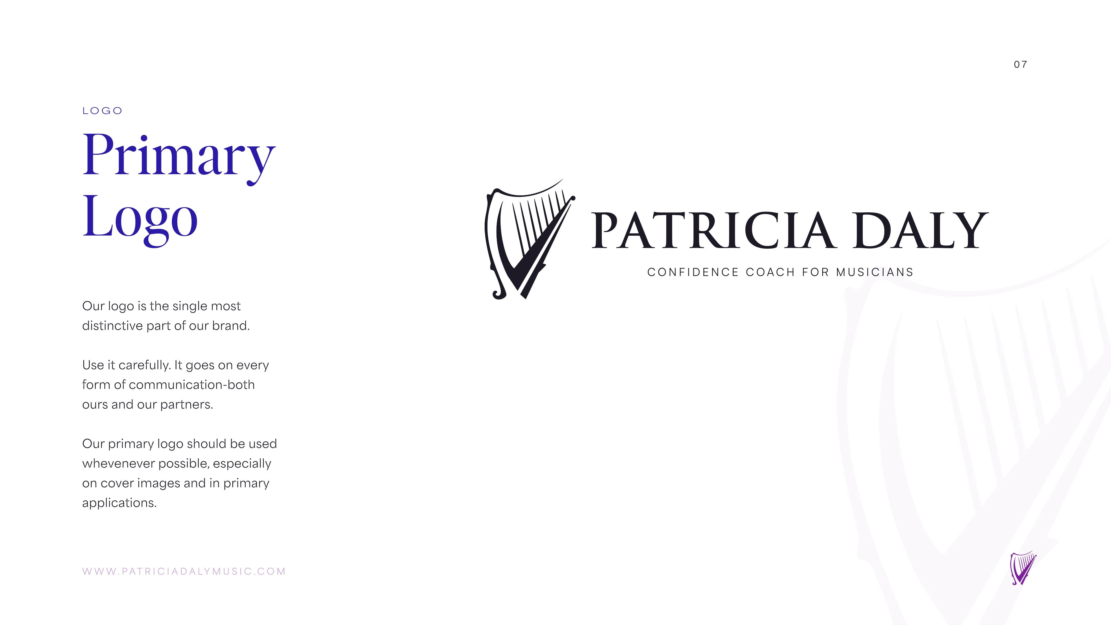
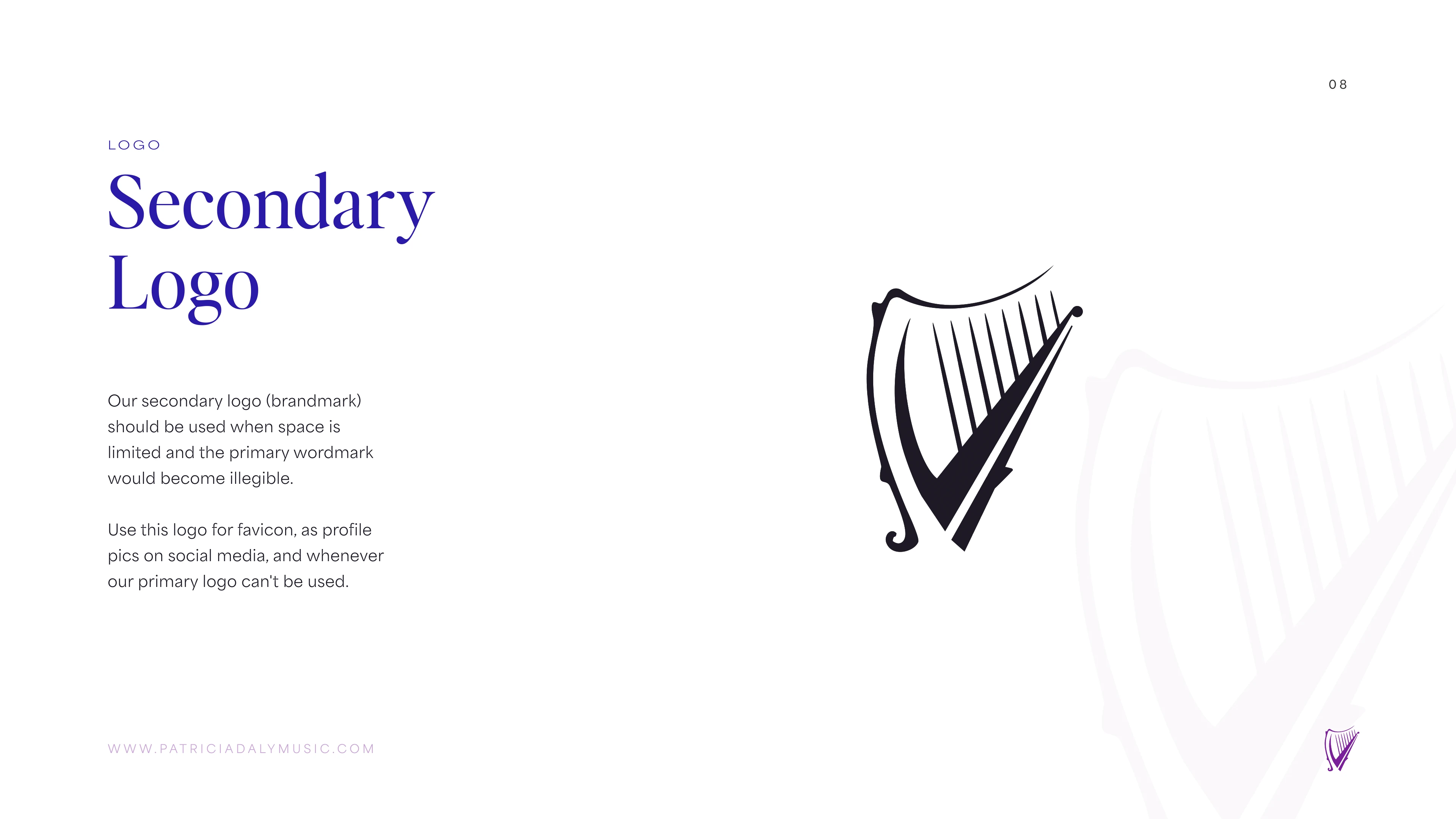
The main logo is a wordmark with classic, restrained lettering and a subtle musical rhythm. The custom spacing and refined serif letterforms give it instant credibility on course certificates, recital programs, and website headers.
We also made a monogram for small spaces. It works as the favicon, social avatar, app icon, and even a wax-seal style mark for physical sheet music binders.
Color
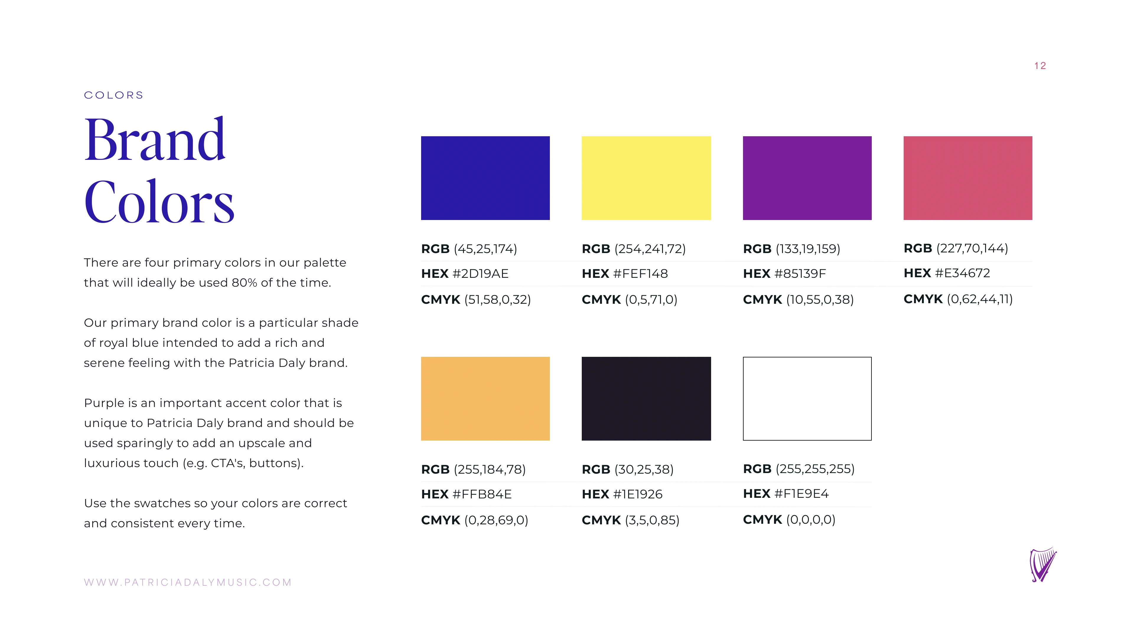
The palette is built around four main colors, which should cover about 80% of what people see.
- Royal Indigo (
#2D19AE): Our main brand color. It feels calm, rich, and trustworthy, with the depth of classical music behind it. - Violet (
#85139F): The accent color. We use it sparingly for buttons and the moments that matter most. - Amber Gold (
#FFB84E): Warm and welcoming. It makes the brand feel friendly and approachable. - Sun Yellow (
#FEF148): Used for small highlights, badges, and pops of energy. - Coral Pink (
#E34672) and Midnight (#1E1926): Two supporting tones. Pink adds emphasis, and the dark shade gives us a deep background to work against.
Typography
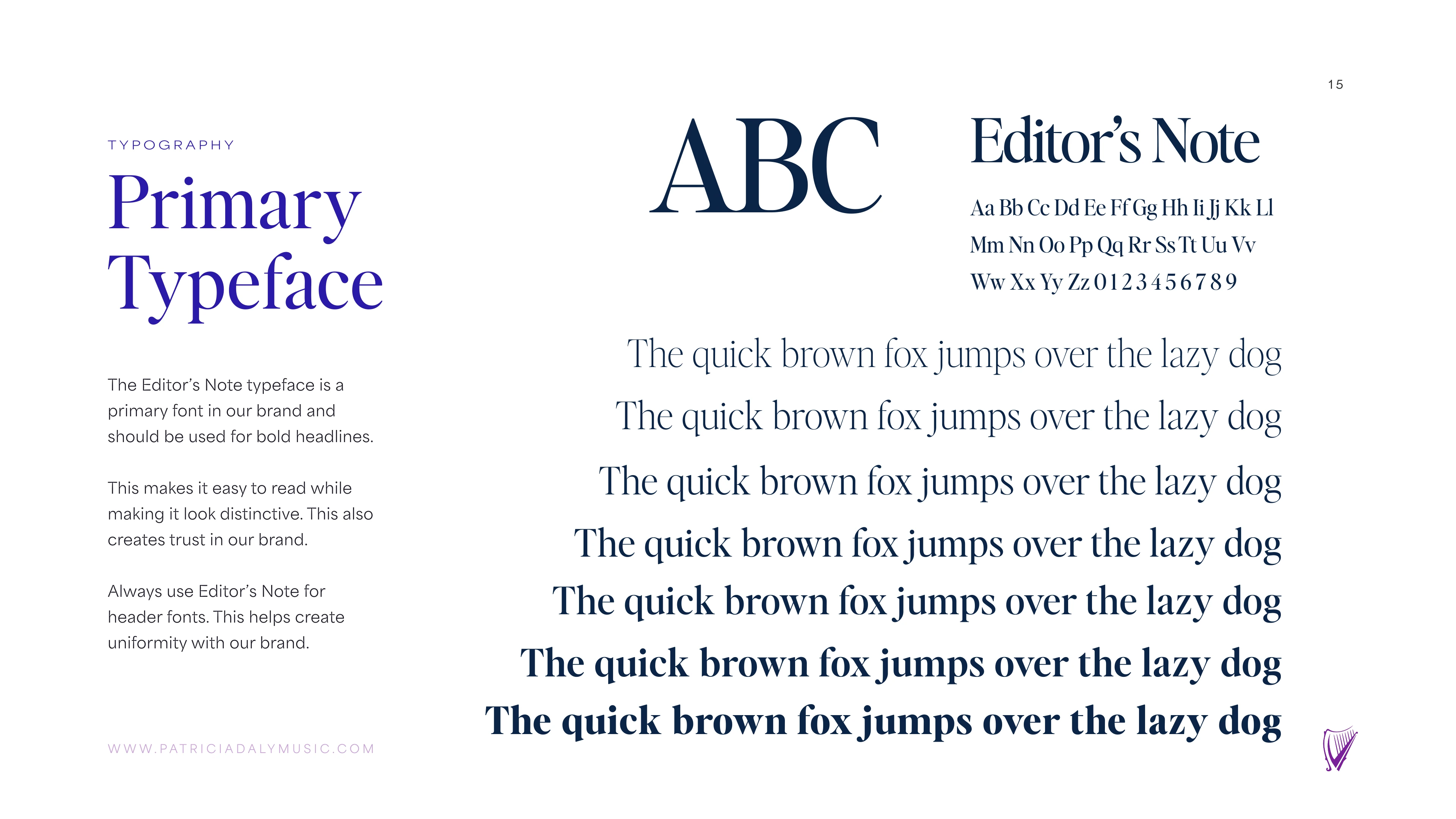
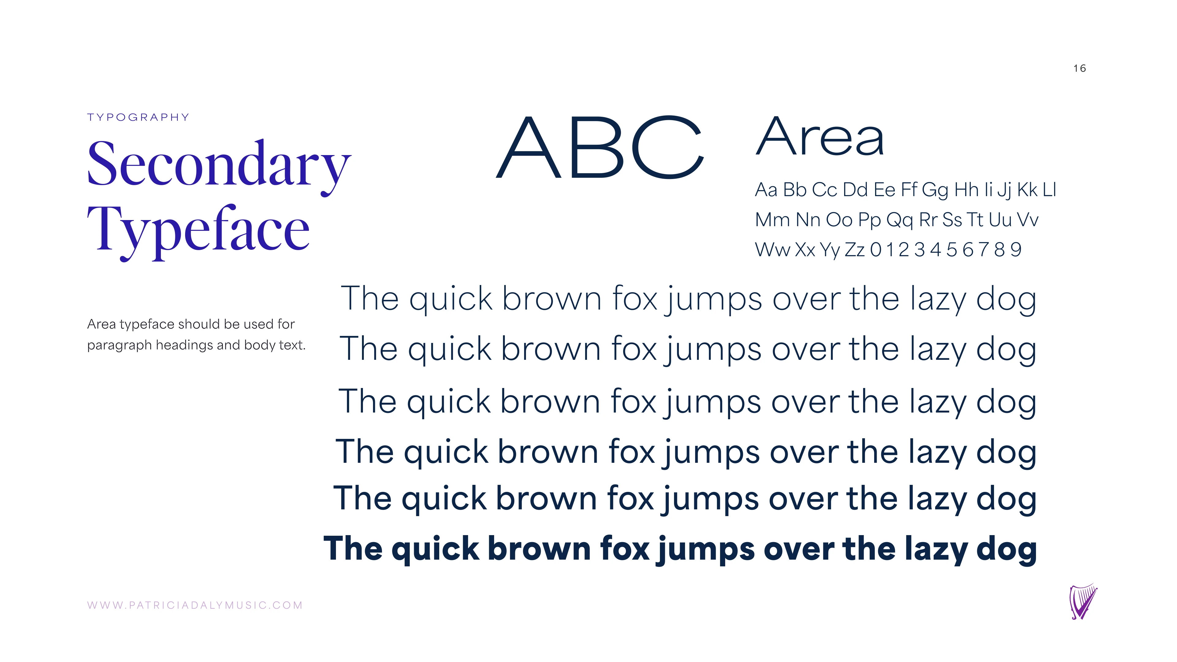
We wanted the brand to feel classic but still easy to read on a screen, so we chose two fonts.
- Headlines: Editor’s Note. A refined serif with real presence. It nods to old sheet music folios and printed journals.
- Body text and interface: Area. A clean, friendly sans-serif that stays easy to read in long lessons, on the website, and on a phone.
Pattern and Icons
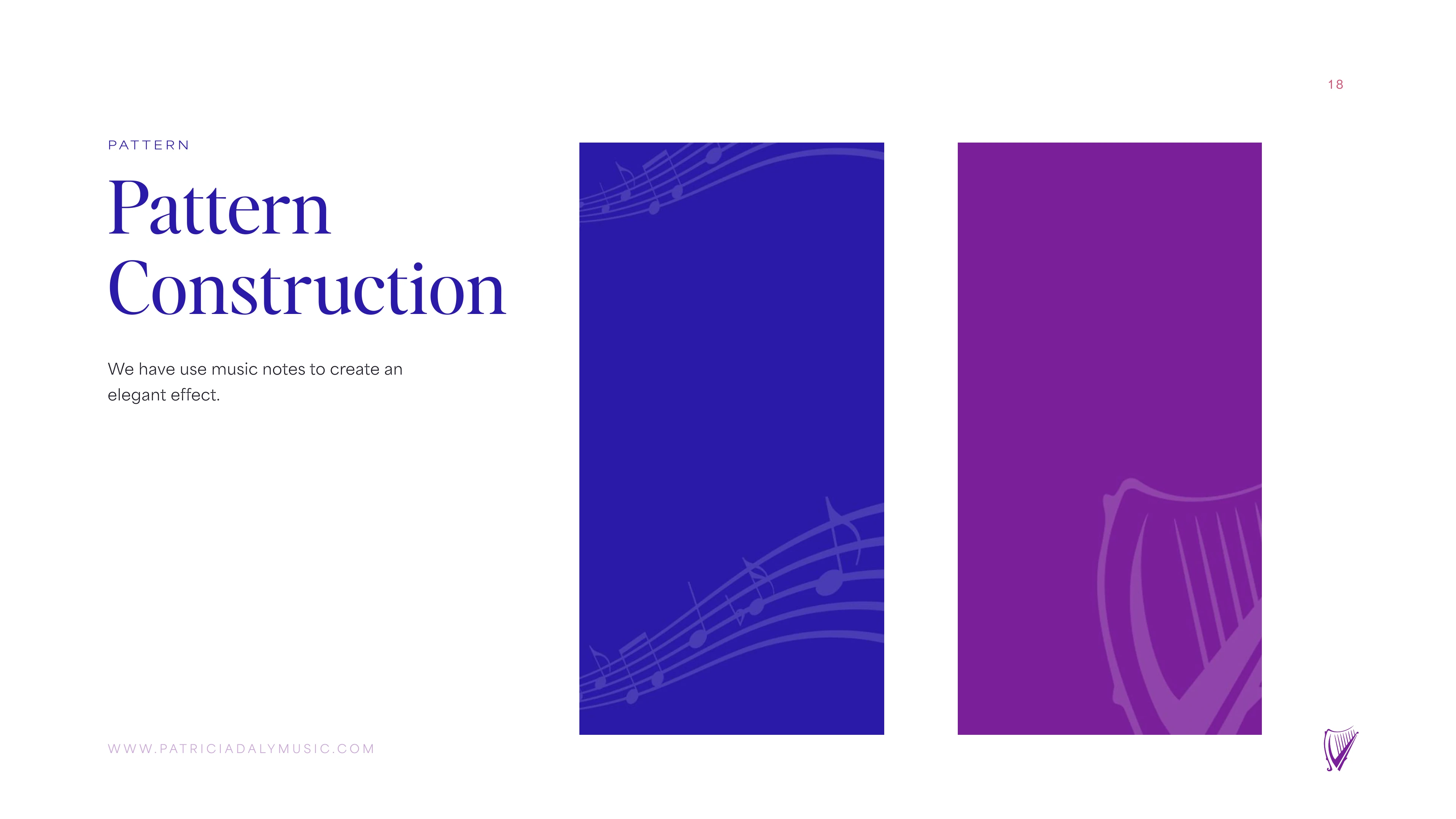
Technical music content can feel stiff, so we built a pattern from flowing staves and musical notes. It adds a soft texture to slides, course dividers, and packaging.
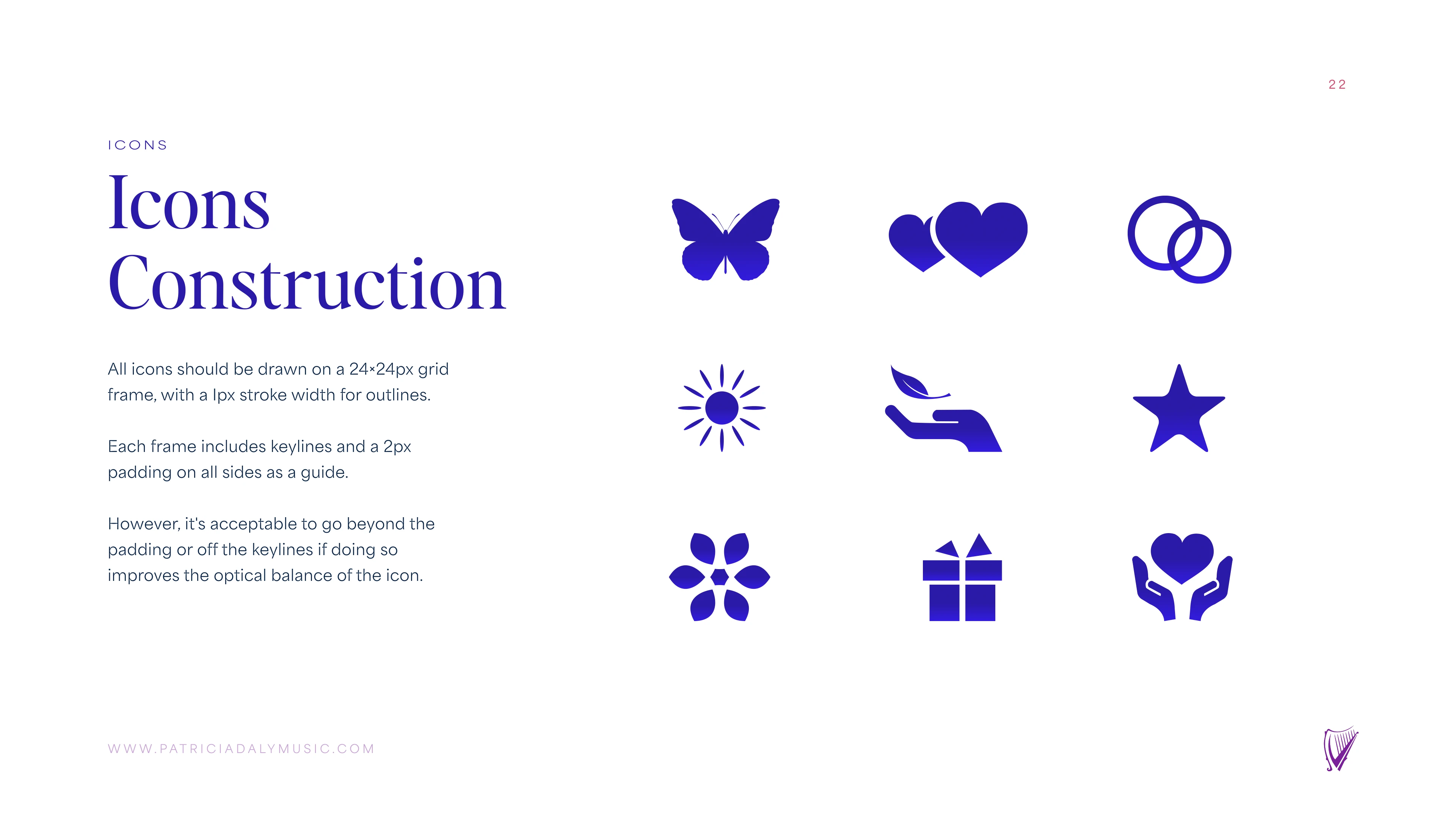
We also drew a custom icon set on a 24×24 grid, so every icon has the same size, weight, and feel.
Social and Brand Guidelines
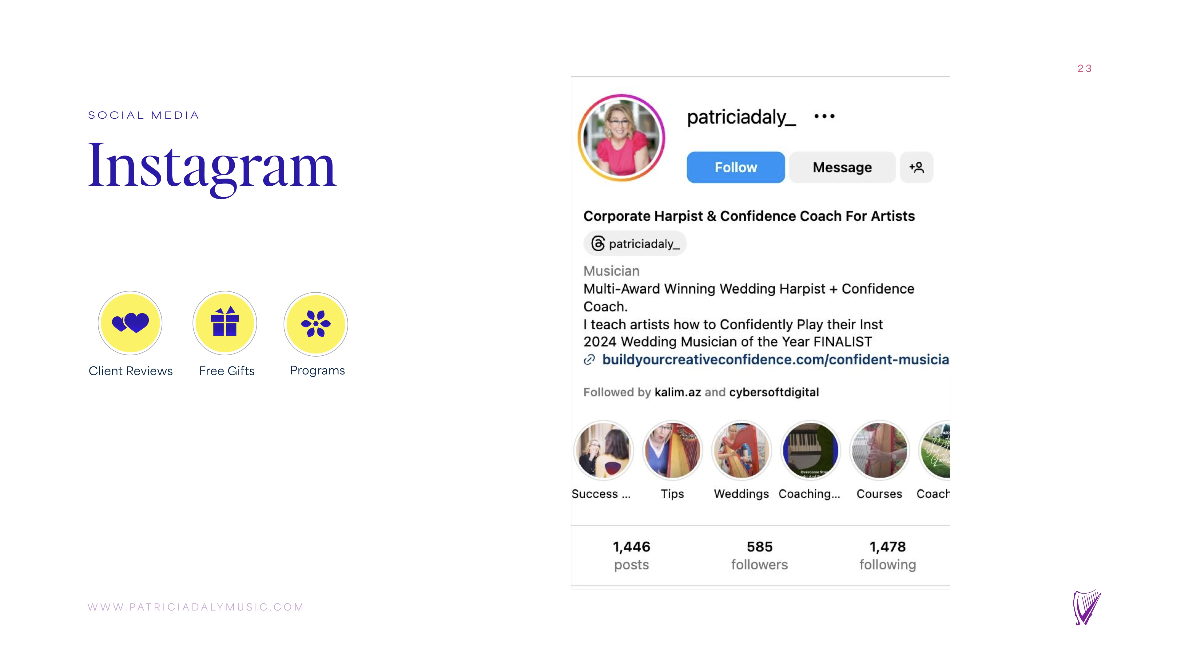
We handed over everything ready to use: Instagram highlight covers for Programs, Client Reviews, and Free Gifts, plus the full 23-page brand guide. Anyone on the team, or any outside designer or developer, can now create on-brand work without guessing.
Branding Guide
The Outcome
Once the new identity went live, Patricia’s brand finally looked like the established music institution she already was.
- +310% Masterclass Inquiries: Qualified applications for private mentoring and conservatory audition masterclasses jumped within the first 60 days.
- 100% Visual Consistency: Her website, course portal, sheet music folios, and social pages now all look like one brand.
- Sub-Second Page Loads: Optimized WebP images and a lightweight static site bring the page load time down to 0.54 seconds.
- Prestige Partnerships: The new look opened the door to inquiries from leading conservatories and international arts foundations.
Loading brand guide...
Preparing interactive pages
Get started with Cybersoft Digital
Ready to scale your business with high-performance digital solutions and seamless automation?
Book a Free Strategy Call