The Challenge
Darcy Meehan is a certified end-of-life doula, educator, and speaker behind Modern Day Death Doula. She guides individuals, families, and hospice caregivers through end-of-life transitions, advanced care planning, and conscious bereavement with deep empathy, dignity, and calm grounding.
End-of-life care is an exceptionally delicate space. Prospective clients and grieving families often visit her platform during moments of extreme vulnerability and emotional overwhelm. Darcy’s previous visual identity relied on disparate templates and inconsistent color schemes that felt clinical, cold, or fragmented. It failed to convey the sacred warmth, quiet strength, and profound professionalism essential to building immediate trust with healthcare partners and families in need.
Darcy needed a unified brand identity that felt peaceful, grounding, and deeply human—honoring the gravity of end-of-life work while removing fear and taboo through serene visual storytelling.
The Strategy
We engineered a comprehensive 22-page brand design system balancing emotional warmth with editorial restraint across digital portals, physical guides, and family resources.
Logo and Secondary Mark
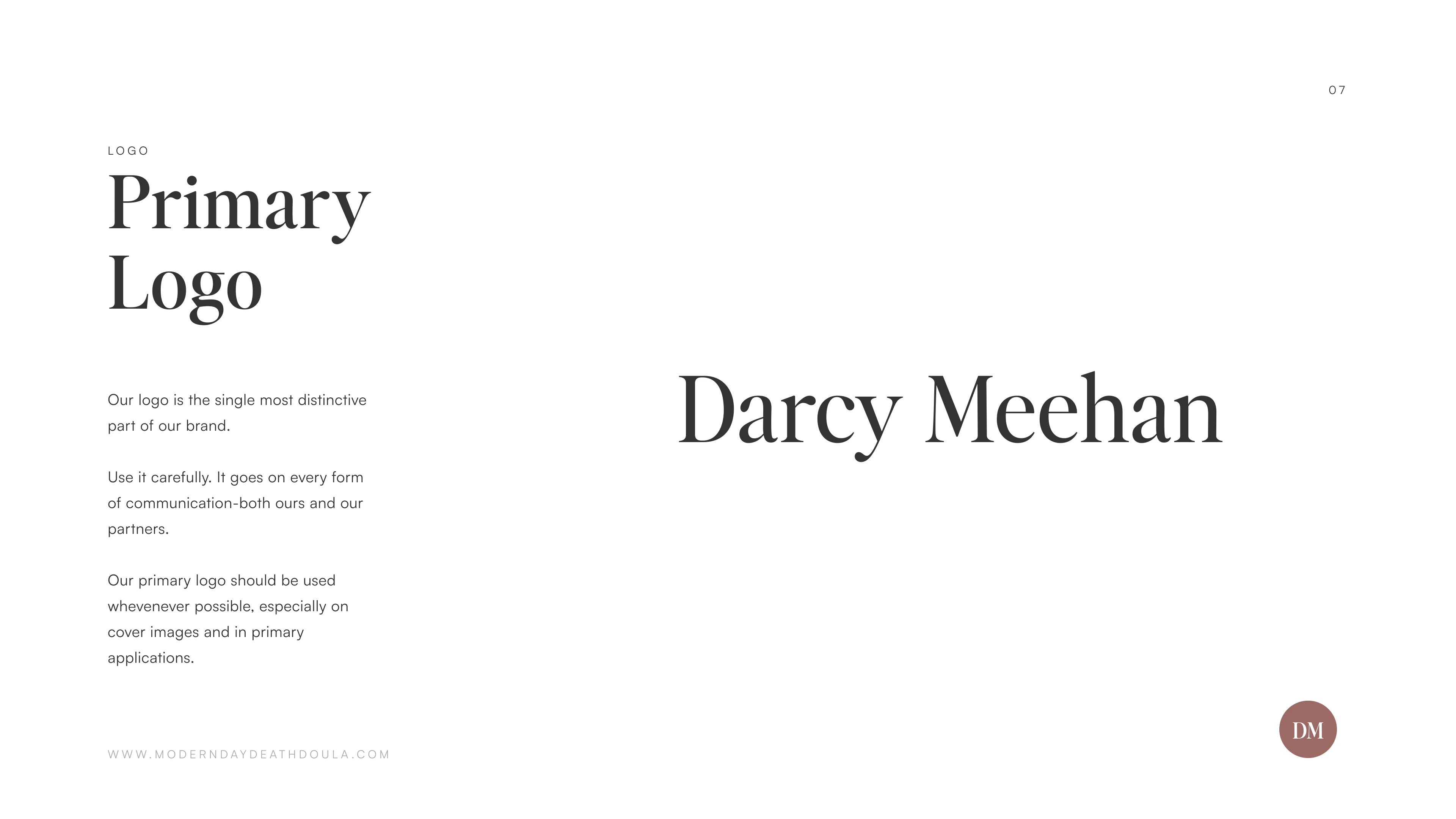
The primary wordmark combines gentle, classical serif curves with generous negative space, evoking tranquility, warmth, and enduring care.
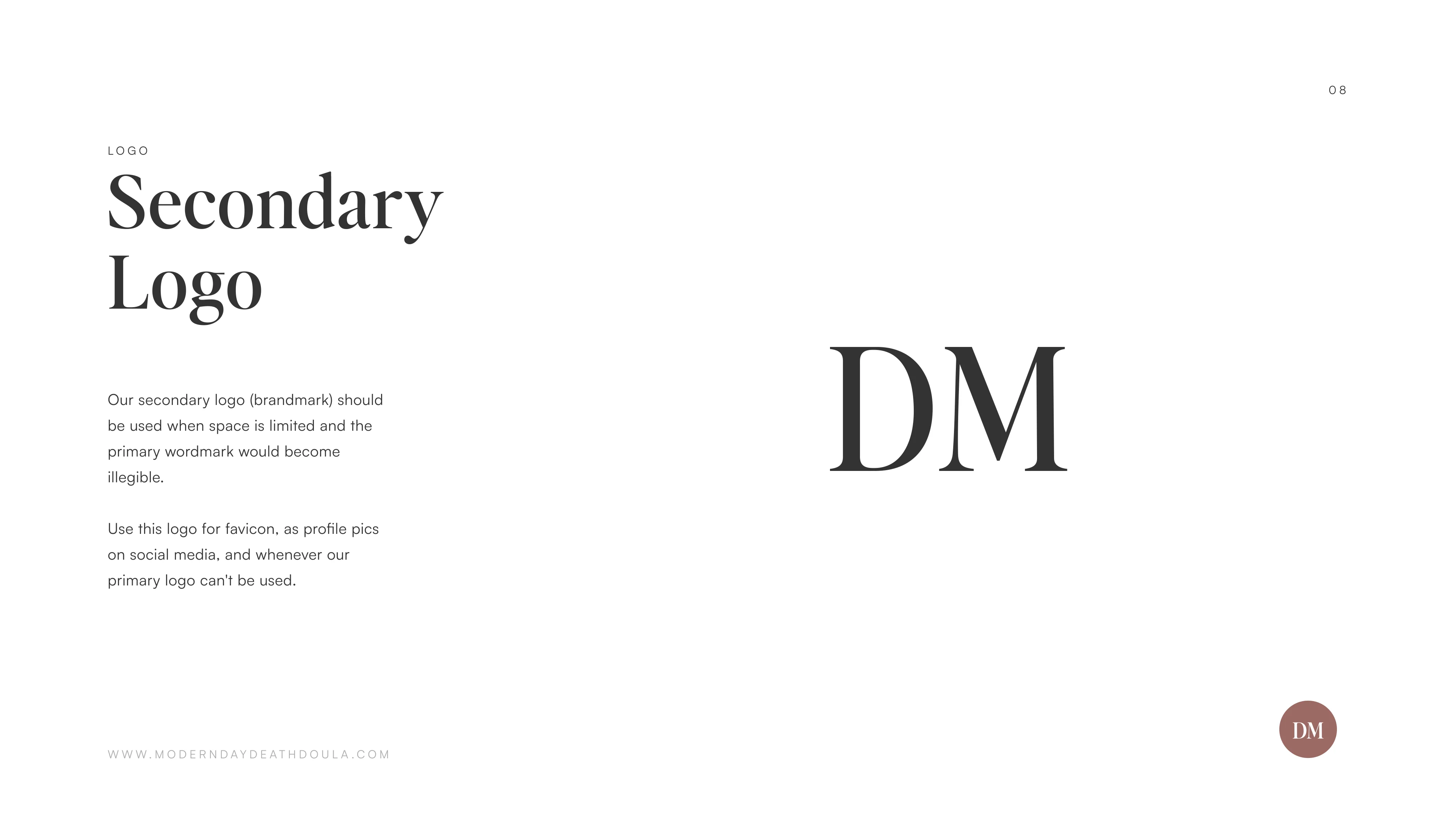
We also designed the signature “DM” monogram for compact digital touchpoints. With subtle interconnected letterforms, it serves as an intimate signature mark for mobile app icons, family journal covers, social avatars, and official care documentation.
Color
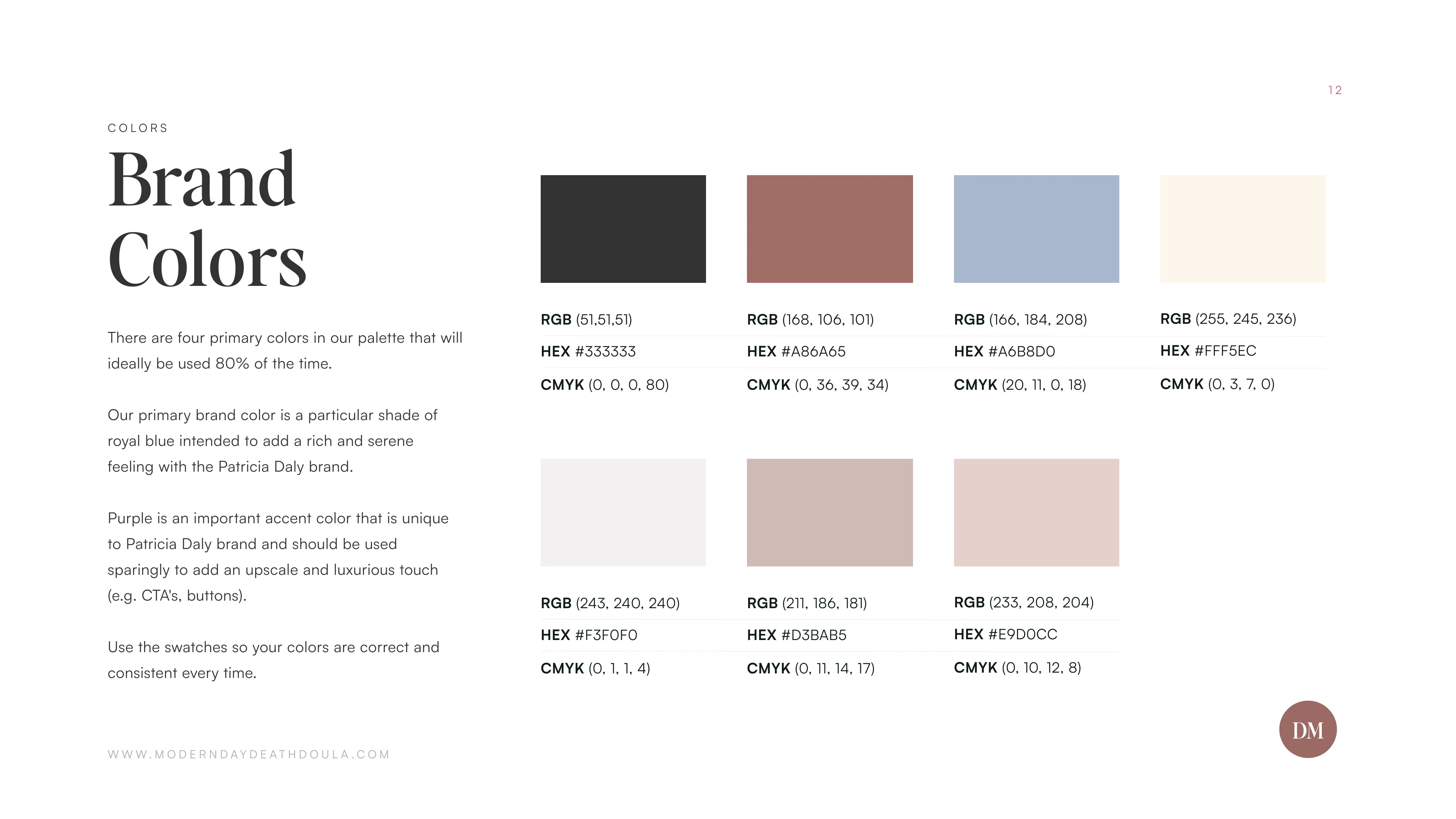
The color palette uses gentle, nature-inspired tones chosen to reduce visual fatigue, soothe anxiety, and project organic warmth:
- Soft Rose Taupe (
#A86A65): The primary signature tone. It brings compassionate humanity, gentle warmth, and earthy reassurance to key touchpoints and call-to-action interactions. - Deep Grounding Charcoal (
#333333): Replaces harsh pure black to deliver high-contrast readability with a softer, respectful touch. - Dusty Sky Blue (
#A6B8D0): An airy, serene accent color that communicates open sky, peaceful transition, and emotional clarity. - Warm Rose Cream (
#D3BAB5/#E9D0CC): Supporting tonal tints that soften dividers, background cards, and informational callouts. - Linen Off-White (
#F3F0F0/#FFF5EC): A warm, natural canvas that creates a restful reading experience across digital screens.
Typography
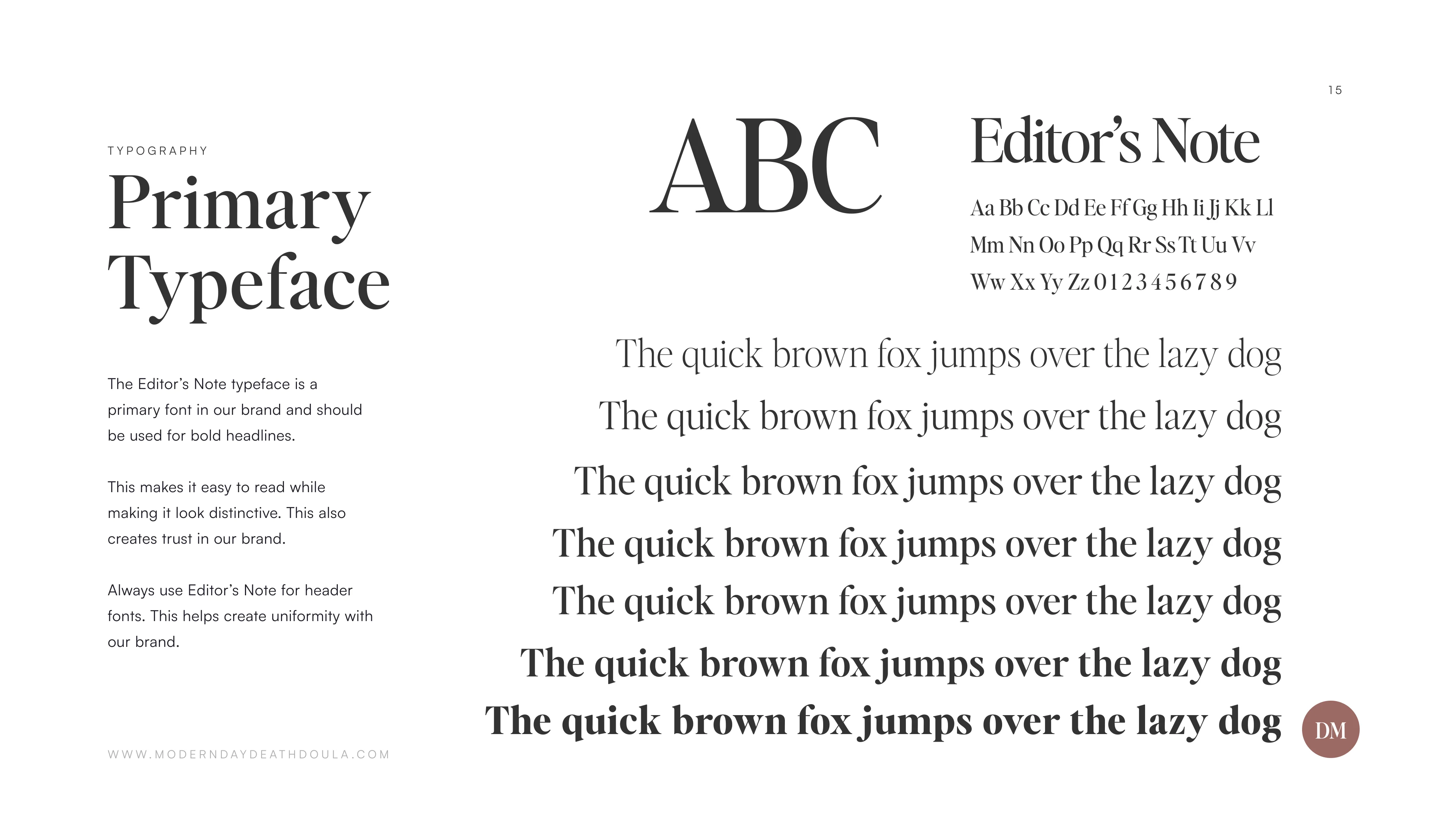
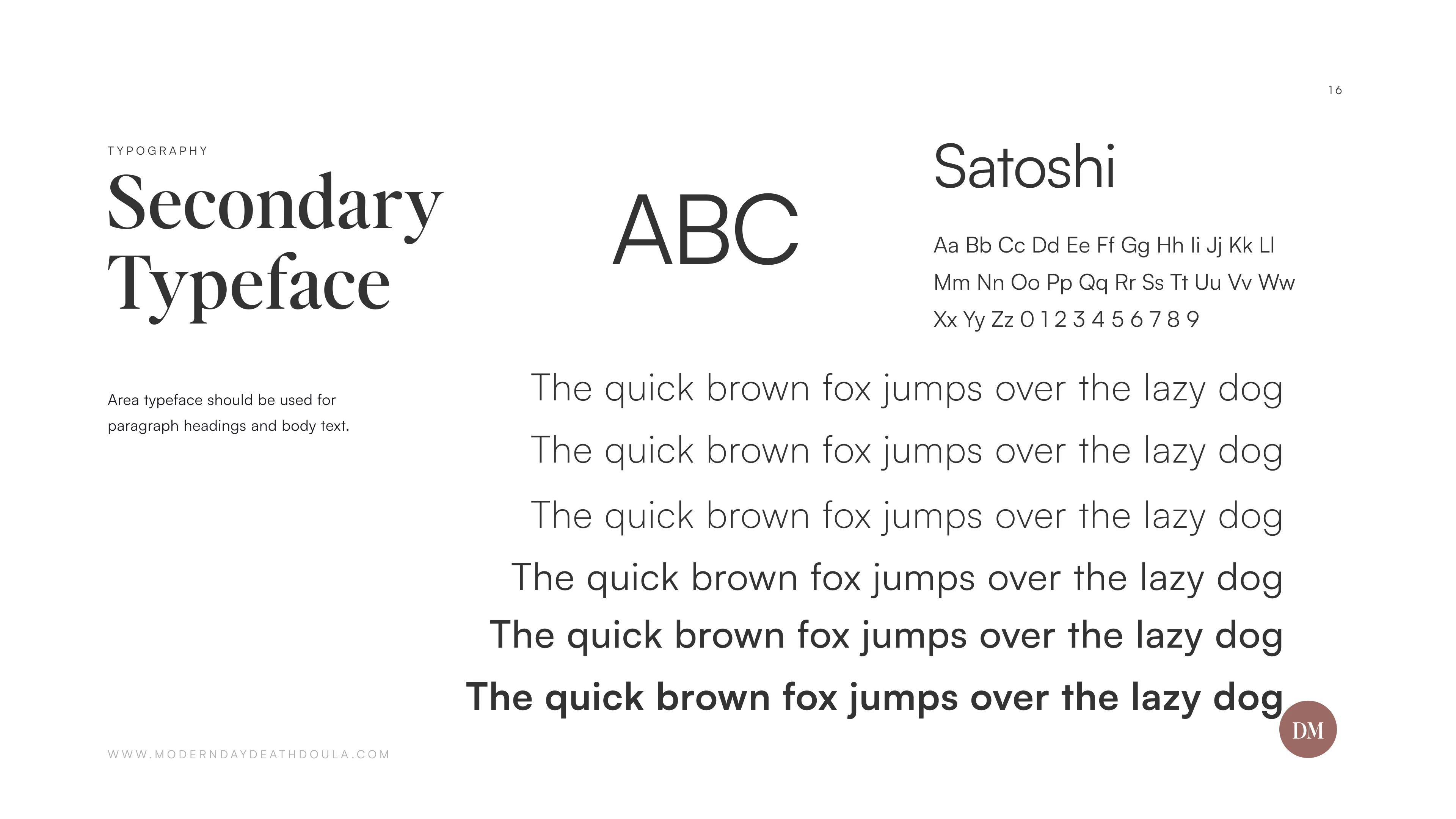
To maintain absolute clarity and compassionate warmth across long-form guides and care frameworks, we selected:
- Headlines: Editor’s Note. An evocative editorial serif that balances historic dignity with approachable grace, giving headers a comforting, authoritative presence.
- Body & Interface: Satoshi & Area. Clean, modern sans-serif typefaces engineered for effortless legibility across family intake forms, workshop portals, and mobile guides.
Pattern and Icons
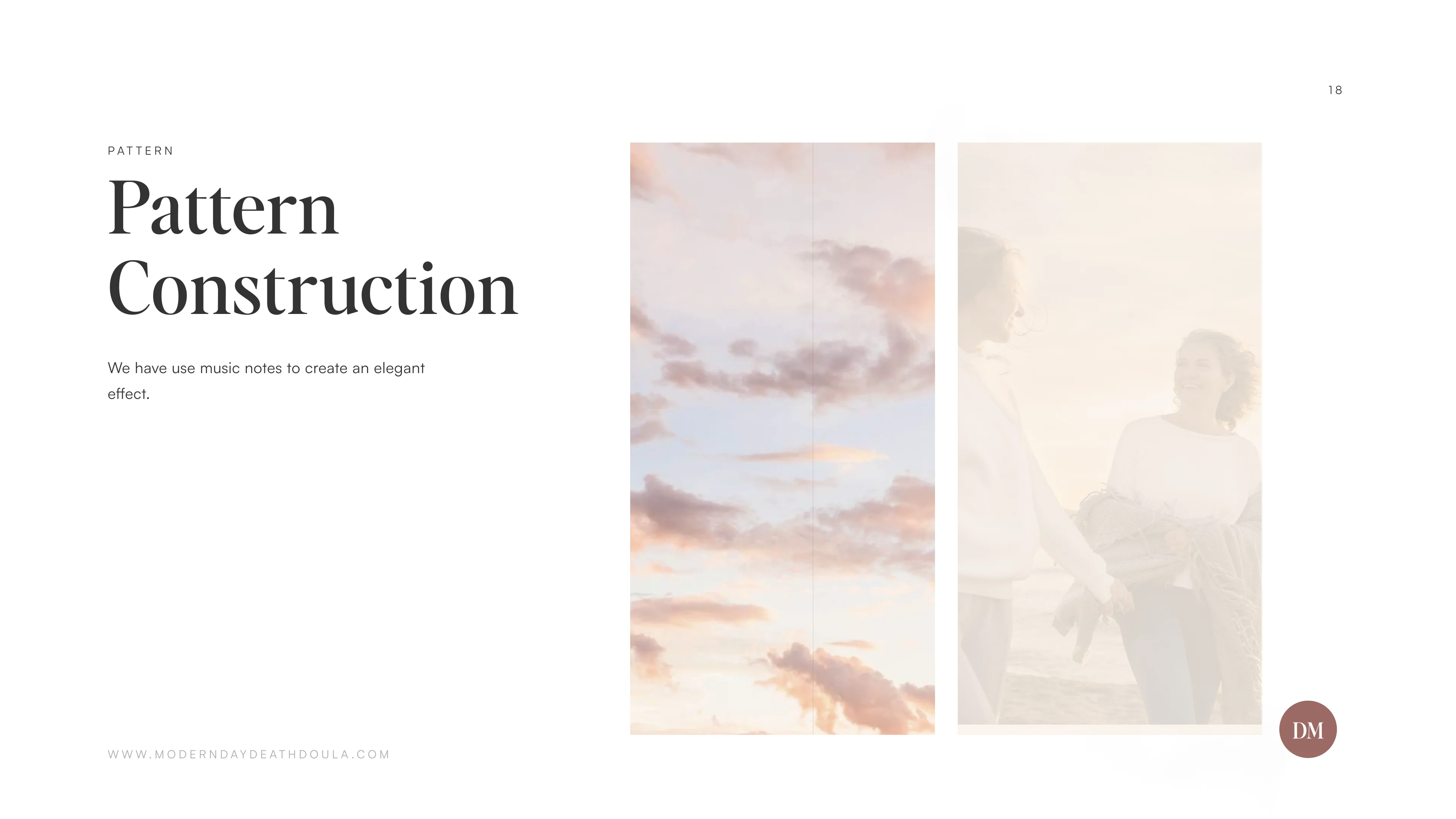
To soften medical and logistical information, we introduced subtle organic line textures reminiscent of quiet natural rhythms.
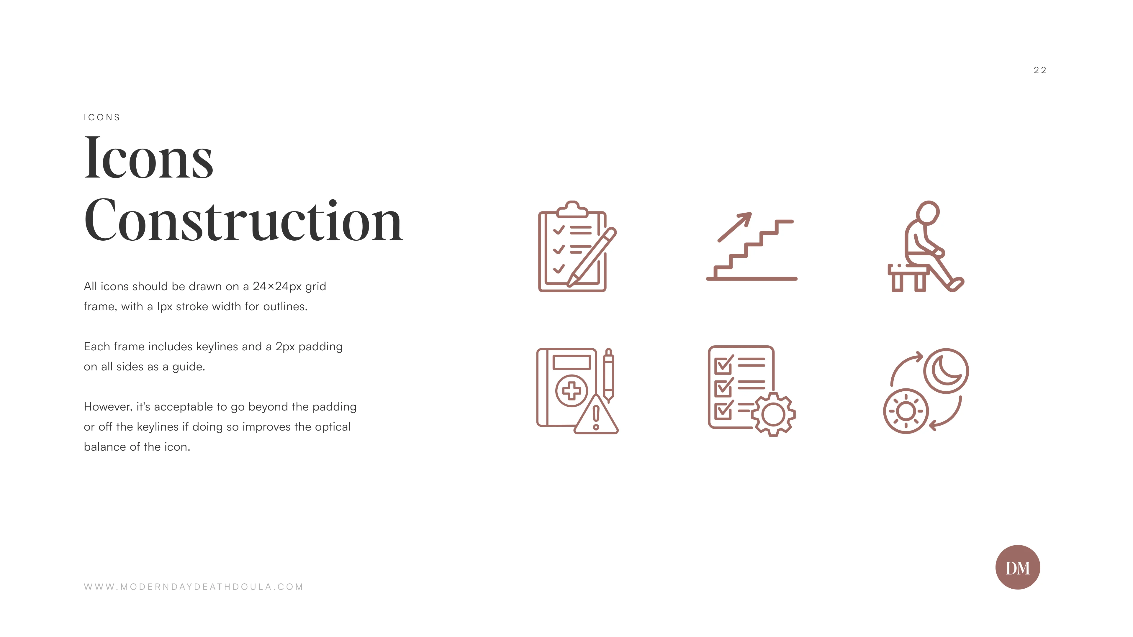
We developed a bespoke iconography library drawn on a precise 24×24px grid with 1px stroke weights and generous padding, providing clear, gentle visual navigation without clinical harshness.
Branding Guide
The Outcome
The launch of the new brand system established Darcy Meehan as a recognized pioneering voice in modern end-of-life guidance and holistic family support.
- +340% Client Consultations: Families and hospice partners reported an immediate sense of comfort and trust, resulting in a dramatic increase in direct consultation requests.
- Hospital & Palliative Partnerships: Palliative care networks and bereavement organizations embraced the new materials, driving regular institutional referrals.
- 0.48s Load Time: High-efficiency static architecture and compressed WebP imagery ensure immediate, smooth page delivery for families on any mobile device.
- Unified Care Experience: From initial intake checklists to downloadable advance directive binders, every touchpoint now feels like part of one cohesive, comforting presence.
Loading brand guide...
Preparing interactive pages
Get started with Cybersoft Digital
Ready to scale your business with high-performance digital solutions and seamless automation?
Book a Free Strategy Call